Graphic, Web, UI, UX, Product Designer.
Based in Buenos Aires. I think, tinker, and push past boundaries — designing products people actually love using.
Go to LinkedIn ↗


I'm a product thinker at heart. I love mapping messy workflows, asking the right questions and turning complexity into intuitive experiences that actually make sense to real people.
The best products emerge from curiosity, empathy and continuous iteration. Working in Figma is only one part of my process — the real work happens through conversations, research, systems thinking and understanding how people behave.
For more than 10 years I've designed products across fintech, mobility, food-tech, AI and SaaS — with startups, scale-ups and enterprise teams across Latin America, Europe and the US.
What excites me most is the moment when business goals and human needs finally align.
I design complex digital products and use AI to accelerate research, exploration, prototyping and iteration — without losing the human judgment behind the work.
AI is deeply integrated into my design workflow — not as a replacement for design thinking, but as a force multiplier that lets me spend more time on strategy, user experience and cross-functional collaboration.
My primary tool is Figma & Claude, which I use across the whole product design lifecycle. A few of the ways:
From stakeholder language, to dev handoff, to shipped product — I keep the original intent intact the whole way through.
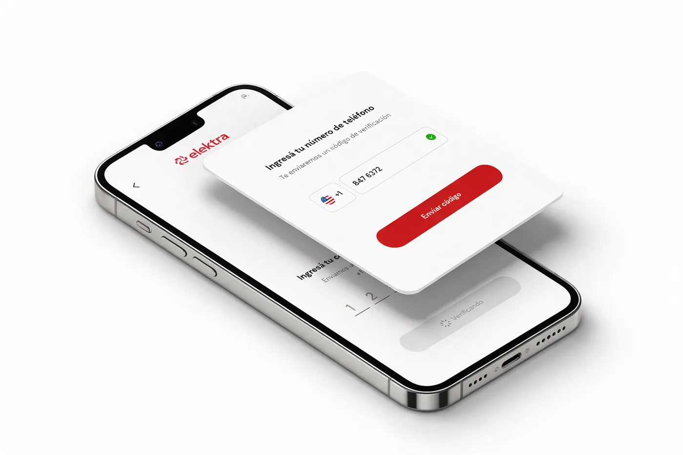
Leading product design for a Web3 remittance platform simplifying crypto payments from the US to Latin America. End-to-end design from discovery to delivery.
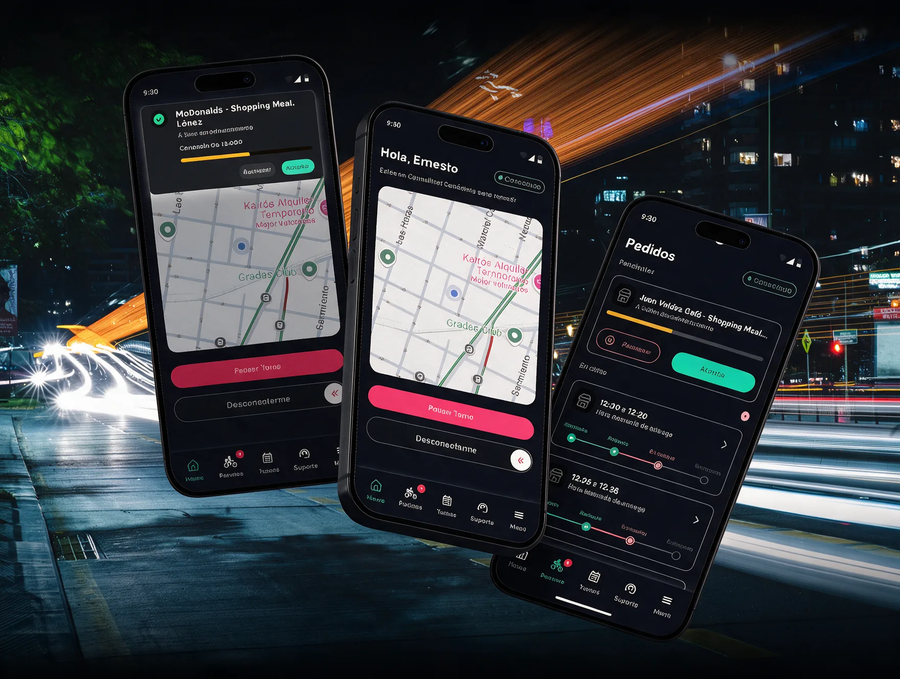
Drove the product relaunch and embedded design excellence across Muv (ride-hailing) and Monchis (food delivery). Contributed to the Vendoor Tool and Drivers App, and led the end-to-end launch of Smart Pass, the group's flagship smart-venues platform.
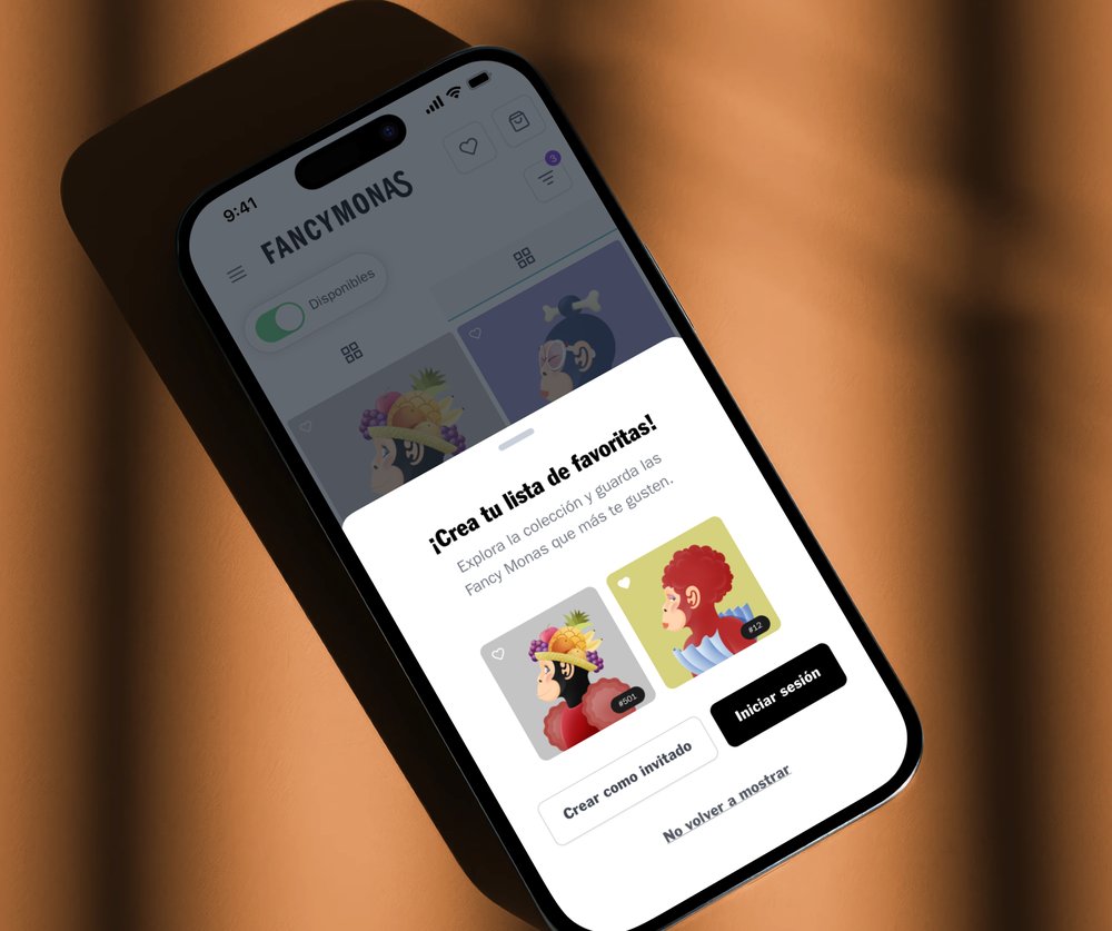
Collaborated from zero to 100% with founders to launch the Marketplace. Created functionalities around user needs, introduced agile practices, and designed and implemented features for Tibetpass, the new ticketing vertical.
Reduced design time 30% by implementing a design system for consistency across platforms. Lifted engagement 10% and cut onboarding time 15% with more intuitive screens, and established core design principles to guide product direction.
Proposed new visual guidelines that raised consistency across B2B and B2C products and reworked 100% of the native app flows. Part of the Demand team, lifting CVR 6% with new features for reviews, menus and photo galleries.
Built the product from scratch with the founding team — user research, ideation, prototyping, user testing and the go-to-market plan. Placed 3rd of 12 in the "La Nube" incubator program.
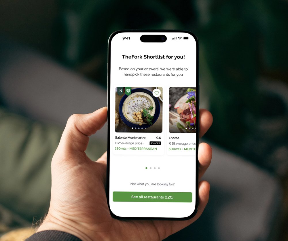
Acquired by TheFork · TripAdvisor in 2019. Increased engagement 10% and retention 25% with a new app homepage, designed B2B and B2C features, and helped build the first design system and design-sprint practice.
15+ countries. Every city is a UX study.
Food is design — every dish is a set of decisions.
Exploring AI-native product patterns daily.
Training the eye for light, composition and detail.
One market teaches you how much context really matters.
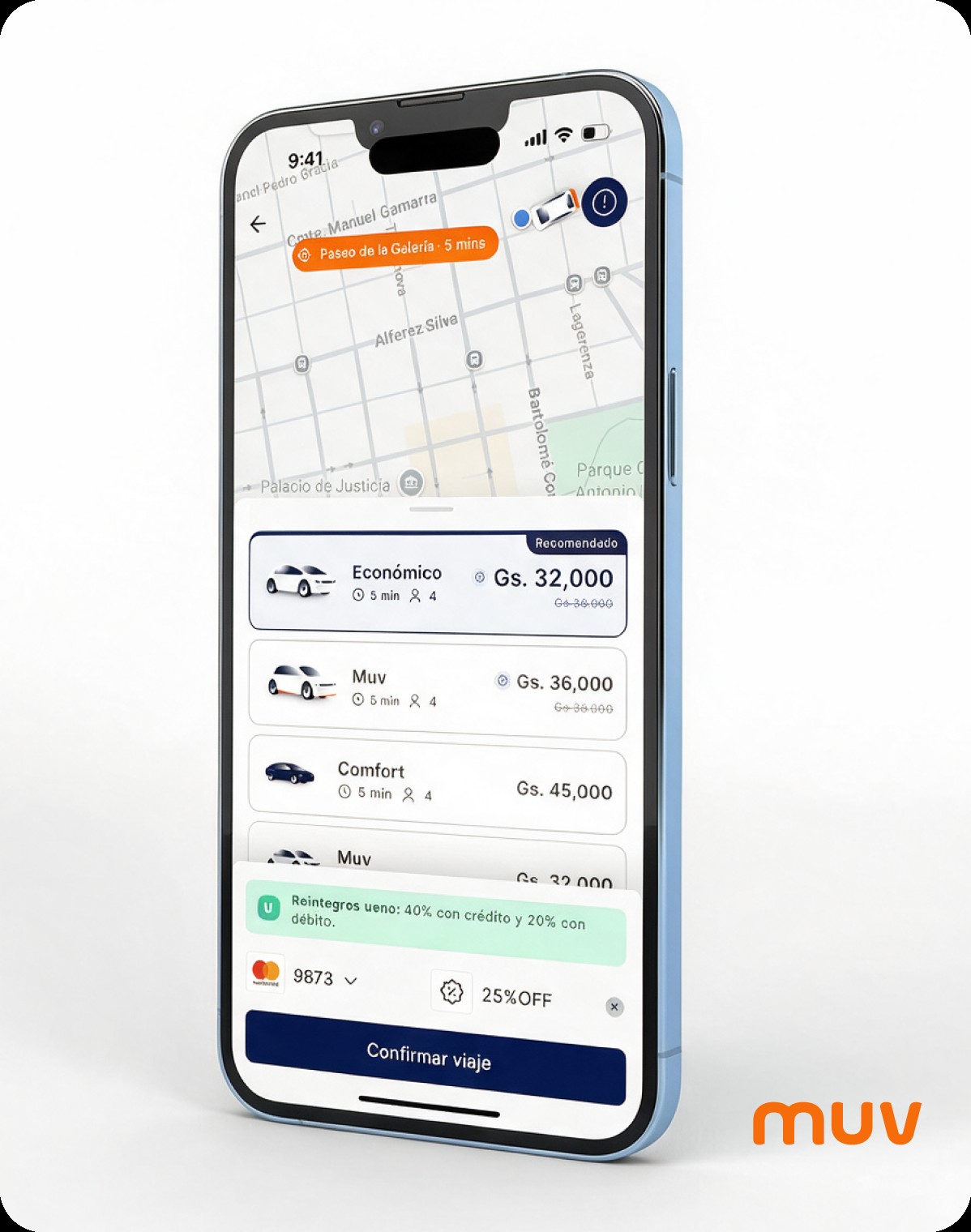
MUV operates a ride-hailing platform where passengers and drivers interact through a real-time system with multiple states and edge cases.
The existing experience showed friction in key moments of the journey, especially during onboarding, ride request and ride status feedback. This generated confusion, slower time to first ride and higher cognitive load for users.
High onboarding abandonment rate. Reduced from 21 to 6 steps, improving completion rate from 25% to 36% (+11pp).
New technical foundations to ensure the app is visually appealing, functional, reliable, and prepared to evolve.
Architecture designed to enable future expansions and greater operational efficiency.
The objective was to design a ride-hailing experience that balances user clarity, technical feasibility and system scalability.
We stabilized the legacy application and created ecosystem initiatives — preparing muv to become the most used mobility platform by users in the group's ecosystem. Demand · Supply · Marketplace.
Competitive analysis. Problem framing and constraints analysis with product and engineering teams.
State-driven flow mapping. Every UI state directly reflects a backend status — critical in real-time products.
Low-fidelity wireframes to validate hierarchy, information priority and state transitions before visual design.
Two proposal rounds tested with real users. Key insight: strong preference for map-based home with nearby vehicles.
High-fidelity UI. New 60/30/10 color system, redesigned typography, icon system, motion and photography guidelines.
Component-driven layout. Figma Dev Mode for visual QA — comparing design vs development with annotated comments.
Given the real-time nature of a ride-hailing product, defining clear ride states was critical. I mapped the full passenger journey as a state-driven flow, ensuring each UI state directly reflects a backend status.
To reduce uncertainty, the interface always communicates the current ride state, even during waiting periods — "Esperando confirmación del conductor... Ampliando radio de búsqueda", "Juan empezó tu viaje", "10 min para llegar a la parada".
We needed to create new colors, more balanced and harmonious. Applied the 60/30/10 rule — the previous system lacked balance.
Screens designed using reusable components to ensure consistency and scalability. Typography, icons, colors, motion, layout, tokens, photography guidelines — all defined as part of the system.
List-based layout with hero photography. Users felt it lacked spatial awareness — didn't help them understand where vehicles were relative to their position.
"There was a clear preference for the home screen that displays a map with the location and nearby vehicles." Users felt immediately oriented and confident.
The reduction in steps translates into an improved completion rate, allowing the value proposition to be showcased from the outset.
Documentation was designed to reduce ambiguity and align design decisions with system behavior. Used Figma Dev Mode to compare designed vs developed versions, leaving annotated style comments.
We created a Gantt chart that would allow us to build the product in an agile and organized way, moving forward step by step with the commitment of the entire team.
State management IS the design. In a ride-hailing product, the most important design decisions aren't visual — they're architectural. Mapping every possible state before opening Figma saved weeks of rework and produced a more coherent experience end-to-end.
Test direction, not detail. The user test insight about map vs. photo wasn't about visual preference — it was about mental model. Users think spatially about transportation. Designing against that mental model creates friction no amount of polish can fix.
Visual QA in Figma Dev Mode changes the relationship with engineering. Annotating the gap between design and implementation directly in the file turned QA from a confrontation into a collaboration. The product quality improvement was measurable.
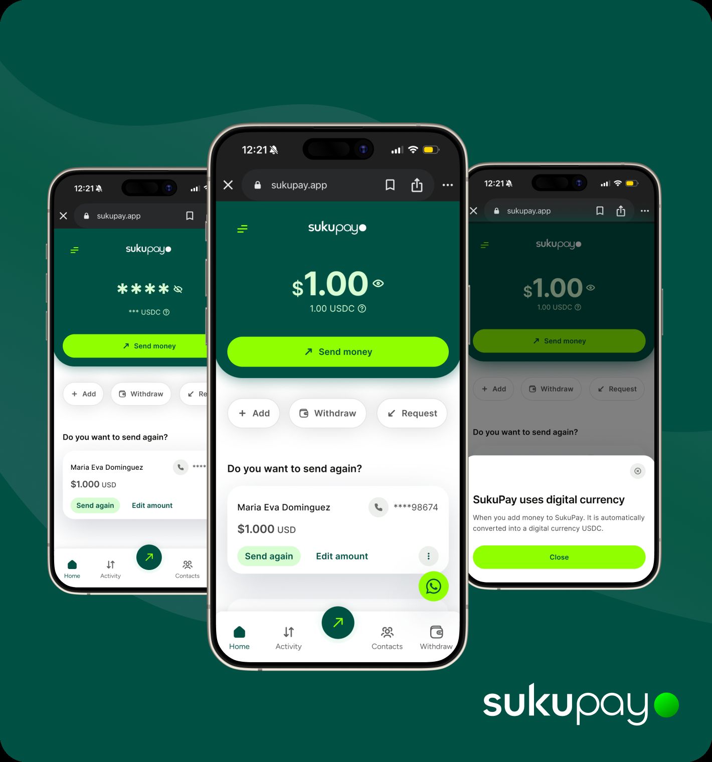
Redesigning the Home experience of a blockchain-powered remittance app to drive trust, speed, and repeat transfers from the US to Guatemala.
SukuPay is a remittance platform allowing users in the US to send money to Guatemala via blockchain rails (USDC). The Home screen is the most critical conversion surface — it's where users decide whether to send money, compare rates, and build trust.
The new version introduced repeat transfer, FX visibility, and promotions — but the experience still had opportunities to improve clarity, hierarchy, and conversion. My goal: evaluate how effectively the current Home supports fast, trust-driven repeat transfers and redesign it to improve confidence and conversion.
Trust-driven
Users abandon apps that feel unsafe, regardless of price.
Monthly repeaters
Remittances are a ritual. Most users send to the same person every month.
Speed-focused
Friction between intent and completion kills conversion.
Price-sensitive
FX rate is a key decision factor. Transparency = trust.
I analyzed leading remittance apps to understand how they balance trust, speed and price transparency on the Home.
Fast repeat transfers, clear delivery promise, emotion-driven ("send to family"), optimized for frequent sending.
Speed reduces friction and increases monthly retention.
Real FX clarity, fee breakdown upfront, "what arrives" visible instantly, minimal functional UI.
Users trust what they can clearly calculate.
Strong brand recognition, security perception, tracking & reliability, massive global coverage.
In remittances, perceived safety drives conversion.
Bank-backed (Banco Industrial), instant wallet/bank receive, phone-number based, daily financial ecosystem in Guatemala.
Recipients trust Zigi's local ecosystem.
SukuPay can win by combining Remitly's speed, Wise's transparency, Western Union's trust, and Zigi's local ecosystem confidence.
I audited the existing Home across four dimensions: clarity, space usage, cognitive load, and repeat transfer optimization.
Clear within 3 seconds: send money globally, in seconds, using only a phone number. Fast, simple, accessible.
Strong partners reinforce credibility. FX rate visibility builds confidence in the product.
Home prioritizes balance and simplicity but underutilizes space strategically. Next step: evolve from transactional tool to trusted financial ally.
Same actions appear at multiple hierarchy levels. Duplication dilutes primary action importance and slows decision-making.
Repeat transfers are a core behavior but aren't surfaced as the primary path for returning users. One-tap resend should be the hero action.
All blockchain complexity from the default flow. USDC, wallets, gas fees — invisible. Users see contacts, amounts, confirmation. Nothing else.
Every interaction designed to build confidence — FX transparency upfront, confirmations, status updates, partner logos. Trust is earned in details.
Returning users should complete a transfer in under 30 seconds. Fewer taps than a bank transfer. The repeat flow should feel like muscle memory.
I proposed two complementary Home states that adapt to user context — because a first-time user and a monthly sender have fundamentally different needs on the same screen.
For first-time users, the priority shifts to funding their account. Primary CTA becomes "Add money" ensuring the interface adapts to user stage and supports a successful first transaction.
For returning users, surfacing the Resend card as the hero interaction reinforces repeat behavior, reduces friction, and positions SukuPay as a trusted financial companion — not just a utility.
I designed three distinct scroll states to maximize usable space while maintaining context — a pattern borrowed from the best mobile finance apps.
Test placement and prominence. Understand main drivers behind user contact and whether a proactive FAQ reduces support volume.
A/B test resend card prominence vs. current state. Measure time-to-complete and repeat transfer frequency.
Measure trust perception with FX rate visible on load vs. post-scroll. Hypothesis: upfront rate increases conversion.
Heatmaps and scroll depth analysis to validate which Home sections drive engagement and which create drop-off.
Blockchain doesn't have to be visible to be powerful. The best UX decision I made was deciding what NOT to show. USDC, gas fees, network selection — none of it matters to a mother sending money to her family. The interface should reflect their mental model, not the technology's.
Repeat behavior is a design decision. If a product's most valuable users are monthly senders, the Home should treat them as such from the first pixel. Context-aware interfaces that adapt to user state aren't a nice-to-have — they're a conversion strategy.
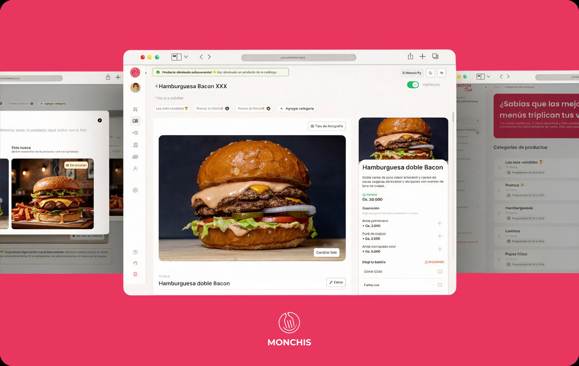
Complete homepage redesign for Paraguay's #1 delivery app — from outdated first impression to a personalized, conversion-driven experience used by 61K users.
The Monchis homepage is the entry point — the most visited section of the app and the first impression with users. It was perceived as outdated and disorganized, negatively impacting experience and trust. In Q3 we prioritized a complete design overhaul: new icons, color palette, typography, and content hierarchy.
The constraint was intentional: rapid execution focused on aesthetic improvements while limiting new feature scope. The goal was a significant leap in perceived quality — not a feature release.
Active users on the platform
Orders processed on the app
Vendors available on platform
Avg. order processing time to reduce
Improve conversion from home to any other section of the app.
Reduce average order processing time from 16 minutes to 5 minutes.
Increase purchase frequency per user by 10% through personalization and reorder shortcuts.
Improve NPS by 0.5 points through a more modern, trustworthy experience.
Before touching a single pixel, I ran a qualitative research phase — collecting direct user feedback to understand the emotional reality behind the numbers.
Disorganized design, outdated icons that don't match vertical categories. Impact: negative first impression drives away new users and reduces trust in the platform.
Users can't quickly find the products they need. Disorganized content creates frustration and abandonment before placing an order.
Users can't easily find favorite stores or repeat previous orders. The opportunity to capitalize on loyalty is completely lost.
A new user logging in doesn't understand the service offered, what they can do, or see any content relevant to them.
I designed for two parallel happy paths — new users who need onboarding and orientation, and returning users who need speed and familiarity.
The final proposal addressed all four core problems simultaneously — with a personalized, context-aware, and visually modern homepage that adapts to user state and time of day.
We deployed the new homepage to production and obtained real metrics from Amplitude (data from 25.11.25) that enabled data-driven decisions for the next iteration.
67%+ of all food category traffic concentrated in burgers and pizza — directly informing the next iteration of category prioritization.
Documentation was designed to reduce ambiguity and align design decisions with system behavior — enabling engineering handoff without friction and future feature development without inconsistency.
Dynamic state system — static, animated placeholder, focused, with results. Contextual copy tied to time and user history.
Sticky header with address display, notification bell, and scroll behavior variants. Documented for all connection states including offline.
Reusable carousel component system with distance, time, and rating metadata. All variants documented with edge cases.
Personalization is the killer feature. The 44.6% CVR was achieved primarily through the customization mechanic — not through visual polish alone. Users convert when they feel the product understands them. Every design decision that felt "obvious" turned out to have a measurable counterpart in the data.
Context-awareness isn't a nice-to-have. Time-aware carousels weren't an aesthetic choice — they were a trust decision. Showing beer promos at 8am told users the app didn't know them. Getting this right changed the emotional relationship users have with the product.
Documentation ships features. Investing in a real design system and handoff documentation reduced QA cycles significantly and enabled the team to move faster on next iterations — proving that system thinking is always a product investment, not overhead.
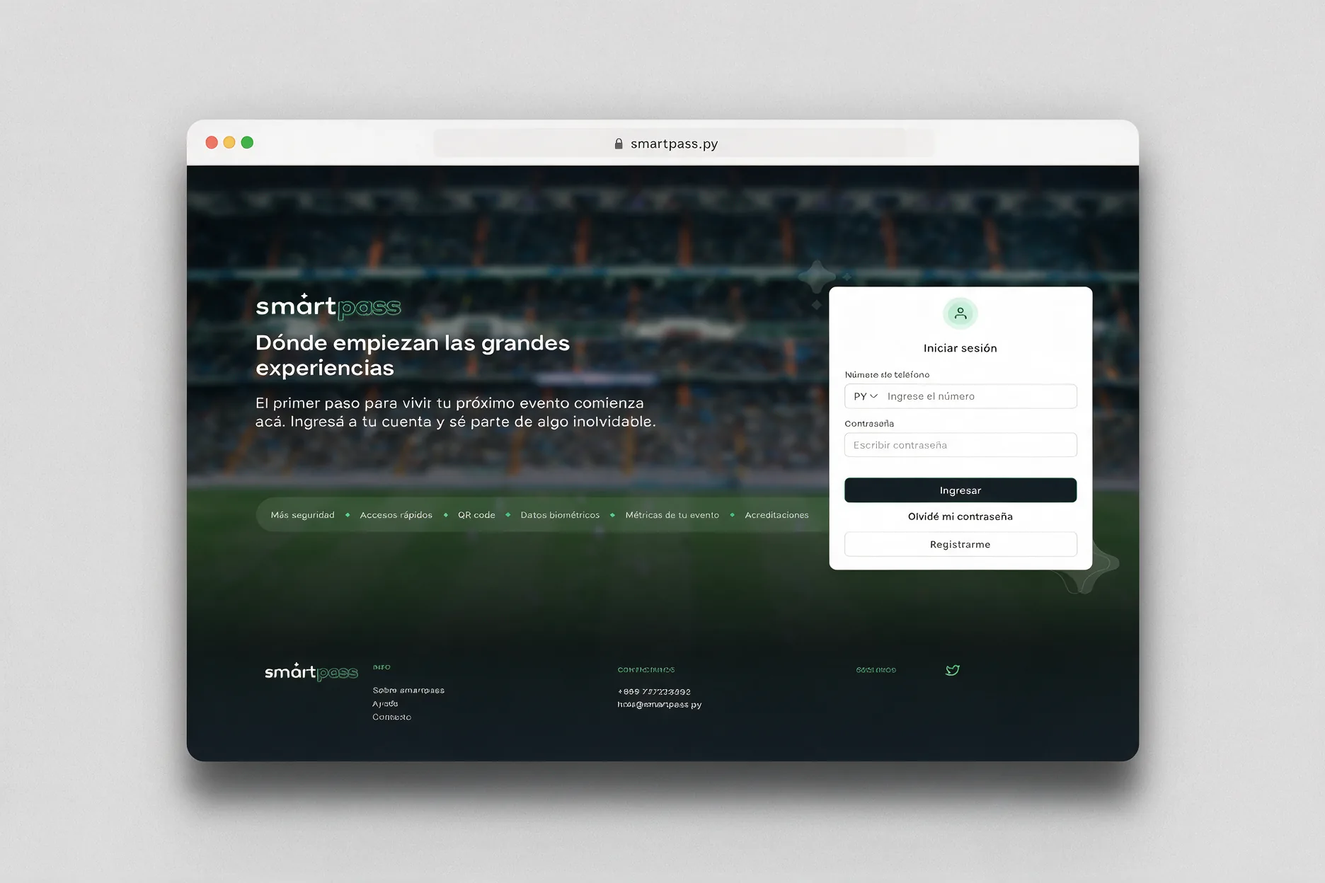
Designing a multi-role access and credentialing platform for mass events — integrating QR codes, facial recognition, and physical credentials into one seamless system.
SmartPass is a technological solution designed to efficiently and securely manage access to spaces. Its approach: integrate physical and digital credentials with advanced technologies — facial recognition, QR codes, and biometric access control — into a single, centralized platform.
The system centralizes permissions management ensuring a streamlined and secure workflow. Its flexibility allows it to adapt to radically different operational contexts — all with the same underlying architecture.
Large-scale concerts, festivals, and public gatherings with thousands of attendees
High-security stadium access with sector-based credentialing and real-time monitoring
Corporate environments requiring controlled daily access and attendance tracking
VIP experiences and exclusive venue access where credential quality reflects brand value
Reduction and elimination of fraud in access to spaces. Improved control and monitoring of attendees. Real-time data generation for analysis and decision making.
Automation of manual tasks that previously consumed operator hours. Optimization of resources and time across all roles in the credentialing chain.
Improved user experience at every touchpoint — from the organizer creating the event to the participant showing their QR at the gate.
Competitive analysis of access control platforms. Understanding the technical and operational constraints specific to mass events in Paraguay.
Constraints analysis with the product and engineering team. Defining what "done" looks like for each of the four user roles before any design work begins.
Mapping complete flows for all four roles with every branching state — photo required vs not, QR vs biometric, approval pending vs confirmed.
Low-fidelity wireframes for Super Admin, Admin, Manager, and Participant interfaces — validated against the actual permission hierarchy before visual design.
High-fidelity UI aligned with system logic. Every state covered — success, error, empty, loading, offline. Visual design decisions derived from technical constraints.
Complete component library with token system, state documentation, and developer handoff preparation. Built for future reuse across the ITTI product suite.
Event management is divided into four levels — each with distinct responsibilities, permissions, and interface needs. The design challenge: making each role feel purpose-built while maintaining a coherent system language across all four.
Designing one system where a Super Admin configuring sectors and biometric settings, and a participant uploading a selfie, both feel like the product was built specifically for them.
The event configuration screen was the most complex design problem in the project. A single event can have radically different setups — and the interface had to make all combinations feel intuitive, not overwhelming.
The participant experience is primarily driven by email communications — the interface is the inbox. I designed the full email communication system as three distinct moments in the accreditation journey, each with specific content hierarchy and action.
The SmartPass design system was built from scratch with security and trust as the primary visual language. Every token decision — from the primary green palette to the typography scale — was made to communicate reliability in high-stakes access environments.
When using green as primary color, a different success hue is introduced to maintain semantic clarity — success states use a distinct tint to avoid ambiguity with brand green.
Role-based design is systems thinking at its most demanding. Designing four different interfaces that share one data model — without letting any role see or do what they shouldn't — requires thinking in permissions before thinking in screens. I learned to start every design session by asking "who is this for and what should they NOT be able to do?"
The email IS the interface. For participants, 80% of their experience with SmartPass happens in their inbox, not in the app. Designing the email communications with the same rigor as the UI — hierarchy, state clarity, single action per moment — was one of the highest-leverage design decisions in the entire project.
Security and simplicity are not opposites. The instinct in access control products is to show every piece of data at every moment to convey authority. The real challenge — and the real win — was knowing what to hide. A participant doesn't need to understand QR cryptography. They need to feel confident they'll get in.